Understanding Victron data

mikewroe

Full Member

Messages
74
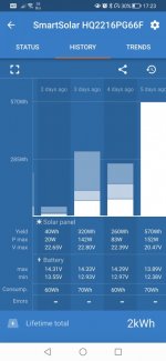
First weekend away with a solar panel fitted. I now have a few days data to review but totally confused by the colouring of the bar graphs.
Can anyone please advise as to the white, grey and blue shadings. Is it as simple as the legend, yield, p. Max and v. Max. If so why only "white" on the first day, shown as 5 days ago?
Screenshot_20230504_172336_com.victronenergy.victronconnect.jpg
 
If you tap on any of the colours for any day the legend and actual values for that day will appear. From bottom to top white is bulk, grey or light blue is absorption, darker blue is float charge
 
Bulk, Absorption, Float - in that order from bottom to top.

So 5 Days ago your batteries were pretty flat so all the charging was Bulk;
Then 4 Days ago you actually got to the stage where you charged the batteries fully;
3 Days ago you made up quite quickly what you used overnight and then soend most of the time in Float.
2 Days ago, very little happened.
I am guessing you finished in the MH 3 days ago lunchtime/early afternoon and it was just parked up? Every time the controller wakes up in the morning, it starts off in Bulk which us why you will always see a time in Bulk and Absorption.
 
Thanks guys for that detailed explanation. I did explore the app and re-read the instructions, but this info did not jump out and grab me.
Thumbs up to the forum again.
 

Users who viewed this discussion (Total:0)

Back
Top