Full Member
Full Member
- Messages
- 4,566
.........A Theoretical Approach.
Everyone in the UK who has solar panels finds that significantly more solar energy is harvested in the summer than in the winter.
And those who live at more northerly latitudes expect to harvest less solar energy than those living in the south.
To put this another way, it's generally accepted that we can harvest more solar energy in the summer and more solar energy at more southerly latitudes.
As a rule of thumb the guidance often given for the UK is something like 'In the winter expect to get about 10% of the solar energy you get in the summer' and 'If you're lucky enough to get to Spain in the winter you'll do better than in the UK'.
Previously I've had a wander around the internet searching for a theoretical approach that confirms these anecdotal comments, but haven't managed to find the sort of thing I was looking for. At the time I decided that if I couldn't find what I wanted, then I would have a go at theoretically quantifying the effect of season and latitude on solar harvesting. The Autumn Equinox is fast approaching and I have some time available while Moho-ing in the West Country - so the time is nigh!
Please bear in mind when judging the following that I'm in the Moho and only have a phone (occasionally) connected to the internet, paper, pencil, pens and the sort of basic calculator that an 'A' level maths student might have had as of about 10 years ago.
I've deliberately kept this post a maths-free zone but I should add right here and now that some people will find some of the technical content that follows somewhat tedious and/or of little interest.
If that's the case for you, then please feel free to scroll down to the graph in the last photo, which summarises the outcome of this earlier stuff.
As always with these things, one has to make a few assumptions. Here are mine:
1. The solar panel is used horizontally.
2. The weather in the winter is generally the same as in summer. That is to say, there is roughly the same proportion of cloud and clear sky in summer and winter.
3. The sun crosses the sky following all or part of something called a sine curve (the sort of pattern that non-breaking waves follow on the surface of the sea or that ripples follow on a pond).
4. Light falling on the solar panel isn't obstructed by trees, hills etc. at any time of the day. That is, light from the sun reaches the solar panel as the sun rises above the true horizon at sunrise and similarly leaves the solar panel as the sun sinks below the true horizon at sunset.
5. The amount of solar energy arriving at a solar panel is proportional to the angle of the sun above the horizon and how long it's at that position.
6. A solar panel and controller starts charging a battery at sunrise and stops at sunset. This assumption agrees extremely well with what my own solar panel and controller does throughout the year.
There are other assumptions such as what happens to light falling on a solar surface at low angles, but I feel that the six assumptions above are those that can be recognised intuitively and are those probably having the greatest impact on the approach I'm taking on solar harvesting.
If you've been lucky enough to be on or above the Artic Circle at midsummer, you may have seen the midnight sun. It's a wonderful sight.
This is a time lapse photo (not produced by me) of the passage of the sun as it crosses the sky in a 24 hour period (fig. 1):

It can clearly be seen that the path of the sun follows a sine curve as described in assumption 3.
Considering fig.1 and assumption 5 together leads us to the conclusion that under these conditions the solar energy arriving at a solar panel in a two hour period (there are 12 strips representing 24 hours) will be proportional to the area between the sun and the horizon of one of the strips on the photo. And the total energy arriving at the solar panel in a 24 hour period would be proportional to the total area of all 12 strips.
That's all very interesting, but what happens at lower latitudes south of the Artic Circle where most of us use our mohos?
(From now on the images are hand drawn so please bear with me!).
If we were to travel further south to the latitude of the Artic Circle (about latitude 67°) and take similar photos on midsummer day, we'd find that the path of the sun just clips the horizon and the path of the sun would look thus (fig.2):
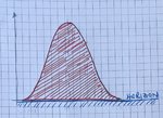
Again, the total energy arriving at the solar panel will be proportional to the area under the curve (the red hatched area is a precise area under the sine curve, whereas the 12 strips described above are an approximation).
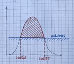
If we now travel south of the Artic Circle at midsummer, the horizon blocks the sunlight for part of the day and the red hatched area becomes smaller; the solar energy arriving at the solar panel is diminished (fig.3):
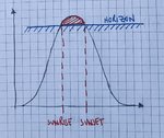
Finally, if we were to revisit this latitude at midwinter the horizon would be blocking even more of our view of the sun's path and the red hatched area would be smaller still (fig.4):
Fortunately there's a mathematical method that allows us to calculate the area below curves (such as the sine curve) extremely precisely. It's one of those things where the outcome is far more interesting than the method so I'll miss the method out here. Having said that, should anyone want to discuss the maths, I'm happy to do so at a meet.
So how can we use this information?
I've selected a latitude (48°) and established the times of sunrise and sunset at midsummer for that latitude.
Using the mathematical method hinted at above, I've then calculated the red hatched area (it looks similar to that shown in fig.3) for midsummer.
For the same latitude (48°), I've then repeated the above for the times of sunrise and sunset at midwinter (this time the hatched area looks similar to that shown in fig 4) to establish the area under the sine curve at midwinter.
In order to compare the solar power available at midwinter with that at midsummer, we can divide the red hatched area for midwinter by the red hatched area for midsummer. In this case we get the ratio 0.21. In other words, the output at midwinter at latitude 48° is 0.21 (or 21%) of the output at midsummer.
I've then repeated the calculations described above at midsummer and midwinter for latitudes 30°, 58° and the Artic Circle at approximately latitude 67°.
At latitude 30° the proportion is 0.46 or 46%.
At latitude 58° the proportion is 0.081 or 8.1%.
At the Artic Circle (about latitude 67°) the proportion is 0.0 or 0% - which is to be expected since the sun doesn't rise at the Artic Circle at midwinter.
And finally, to hopefully make at least some of this information useful, I've plotted proportion of solar output (midwinter divided by midsummer) versus latitude for the 4 latitudes I've mentioned above (fig.5):
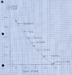
For information I've marked the latitude of a few cities on this graph. If the location of interest to you isn't included, then simply establish your latitude and from the graph read off the theoretical solar proportion figure for that location.
I'm somewhat pleased to find that the mean figure for the UK (at a mean latitude of about 55°) is 0.11 or 11%, which agrees very well with the anecdotal comments one hears and is mentioned in the third paragraph at the beginning of this post.
Other observations I thought interesting:
1. The north of Scotland has a winter/summer proportion half that of southern England.
2. Faro has a winter/summer proportion over twice that of southern England.
3. Marrakech has a winter/summer proportion we should all be jealous of!
Do bear in mind that a solar panel rarely delivers it's rated output, simply because the rated output is measured under a particular set of test conditions that are rarely experienced outdoors in the UK.
If you have a 300 watt panel and the information presented here gives you a winter/summer proportion of 0.15 (15%) then in winter you can assume that your solar panel should be considered the equivalent of a 300 X 0.15 = 45 watt panel under the conditions that you generally use it.
If you've found this post interesting and/or useful I'd appreciate a happy smiley or similar. If the opposite is true then please post a sad smiley or other obviously negative emoji. Your feedback will help me decide whether it's worth expanding on this work to help members estimate, for instance, their winter solar output in a more southerly location compared with their summer solar output in the UK etc, etc.
© Please note that this post is copyrighted and may only be reproduced or distributed in total or part by any means including electronic by permission of the copyright holder who may be contacted via the owner of Motorhomer Ltd.
Colin


Everyone in the UK who has solar panels finds that significantly more solar energy is harvested in the summer than in the winter.
And those who live at more northerly latitudes expect to harvest less solar energy than those living in the south.
To put this another way, it's generally accepted that we can harvest more solar energy in the summer and more solar energy at more southerly latitudes.
As a rule of thumb the guidance often given for the UK is something like 'In the winter expect to get about 10% of the solar energy you get in the summer' and 'If you're lucky enough to get to Spain in the winter you'll do better than in the UK'.
Previously I've had a wander around the internet searching for a theoretical approach that confirms these anecdotal comments, but haven't managed to find the sort of thing I was looking for. At the time I decided that if I couldn't find what I wanted, then I would have a go at theoretically quantifying the effect of season and latitude on solar harvesting. The Autumn Equinox is fast approaching and I have some time available while Moho-ing in the West Country - so the time is nigh!
Please bear in mind when judging the following that I'm in the Moho and only have a phone (occasionally) connected to the internet, paper, pencil, pens and the sort of basic calculator that an 'A' level maths student might have had as of about 10 years ago.
I've deliberately kept this post a maths-free zone but I should add right here and now that some people will find some of the technical content that follows somewhat tedious and/or of little interest.
If that's the case for you, then please feel free to scroll down to the graph in the last photo, which summarises the outcome of this earlier stuff.
As always with these things, one has to make a few assumptions. Here are mine:
1. The solar panel is used horizontally.
2. The weather in the winter is generally the same as in summer. That is to say, there is roughly the same proportion of cloud and clear sky in summer and winter.
3. The sun crosses the sky following all or part of something called a sine curve (the sort of pattern that non-breaking waves follow on the surface of the sea or that ripples follow on a pond).
4. Light falling on the solar panel isn't obstructed by trees, hills etc. at any time of the day. That is, light from the sun reaches the solar panel as the sun rises above the true horizon at sunrise and similarly leaves the solar panel as the sun sinks below the true horizon at sunset.
5. The amount of solar energy arriving at a solar panel is proportional to the angle of the sun above the horizon and how long it's at that position.
6. A solar panel and controller starts charging a battery at sunrise and stops at sunset. This assumption agrees extremely well with what my own solar panel and controller does throughout the year.
There are other assumptions such as what happens to light falling on a solar surface at low angles, but I feel that the six assumptions above are those that can be recognised intuitively and are those probably having the greatest impact on the approach I'm taking on solar harvesting.
If you've been lucky enough to be on or above the Artic Circle at midsummer, you may have seen the midnight sun. It's a wonderful sight.
This is a time lapse photo (not produced by me) of the passage of the sun as it crosses the sky in a 24 hour period (fig. 1):

It can clearly be seen that the path of the sun follows a sine curve as described in assumption 3.
Considering fig.1 and assumption 5 together leads us to the conclusion that under these conditions the solar energy arriving at a solar panel in a two hour period (there are 12 strips representing 24 hours) will be proportional to the area between the sun and the horizon of one of the strips on the photo. And the total energy arriving at the solar panel in a 24 hour period would be proportional to the total area of all 12 strips.
That's all very interesting, but what happens at lower latitudes south of the Artic Circle where most of us use our mohos?
(From now on the images are hand drawn so please bear with me!).
If we were to travel further south to the latitude of the Artic Circle (about latitude 67°) and take similar photos on midsummer day, we'd find that the path of the sun just clips the horizon and the path of the sun would look thus (fig.2):

Again, the total energy arriving at the solar panel will be proportional to the area under the curve (the red hatched area is a precise area under the sine curve, whereas the 12 strips described above are an approximation).
If we now travel south of the Artic Circle at midsummer, the horizon blocks the sunlight for part of the day and the red hatched area becomes smaller; the solar energy arriving at the solar panel is diminished (fig.3):

Finally, if we were to revisit this latitude at midwinter the horizon would be blocking even more of our view of the sun's path and the red hatched area would be smaller still (fig.4):

Fortunately there's a mathematical method that allows us to calculate the area below curves (such as the sine curve) extremely precisely. It's one of those things where the outcome is far more interesting than the method so I'll miss the method out here. Having said that, should anyone want to discuss the maths, I'm happy to do so at a meet.
So how can we use this information?
I've selected a latitude (48°) and established the times of sunrise and sunset at midsummer for that latitude.
Using the mathematical method hinted at above, I've then calculated the red hatched area (it looks similar to that shown in fig.3) for midsummer.
For the same latitude (48°), I've then repeated the above for the times of sunrise and sunset at midwinter (this time the hatched area looks similar to that shown in fig 4) to establish the area under the sine curve at midwinter.
In order to compare the solar power available at midwinter with that at midsummer, we can divide the red hatched area for midwinter by the red hatched area for midsummer. In this case we get the ratio 0.21. In other words, the output at midwinter at latitude 48° is 0.21 (or 21%) of the output at midsummer.
I've then repeated the calculations described above at midsummer and midwinter for latitudes 30°, 58° and the Artic Circle at approximately latitude 67°.
At latitude 30° the proportion is 0.46 or 46%.
At latitude 58° the proportion is 0.081 or 8.1%.
At the Artic Circle (about latitude 67°) the proportion is 0.0 or 0% - which is to be expected since the sun doesn't rise at the Artic Circle at midwinter.
And finally, to hopefully make at least some of this information useful, I've plotted proportion of solar output (midwinter divided by midsummer) versus latitude for the 4 latitudes I've mentioned above (fig.5):

For information I've marked the latitude of a few cities on this graph. If the location of interest to you isn't included, then simply establish your latitude and from the graph read off the theoretical solar proportion figure for that location.
I'm somewhat pleased to find that the mean figure for the UK (at a mean latitude of about 55°) is 0.11 or 11%, which agrees very well with the anecdotal comments one hears and is mentioned in the third paragraph at the beginning of this post.
Other observations I thought interesting:
1. The north of Scotland has a winter/summer proportion half that of southern England.
2. Faro has a winter/summer proportion over twice that of southern England.
3. Marrakech has a winter/summer proportion we should all be jealous of!
Do bear in mind that a solar panel rarely delivers it's rated output, simply because the rated output is measured under a particular set of test conditions that are rarely experienced outdoors in the UK.
If you have a 300 watt panel and the information presented here gives you a winter/summer proportion of 0.15 (15%) then in winter you can assume that your solar panel should be considered the equivalent of a 300 X 0.15 = 45 watt panel under the conditions that you generally use it.
If you've found this post interesting and/or useful I'd appreciate a happy smiley or similar. If the opposite is true then please post a sad smiley or other obviously negative emoji. Your feedback will help me decide whether it's worth expanding on this work to help members estimate, for instance, their winter solar output in a more southerly location compared with their summer solar output in the UK etc, etc.
© Please note that this post is copyrighted and may only be reproduced or distributed in total or part by any means including electronic by permission of the copyright holder who may be contacted via the owner of Motorhomer Ltd.
Colin
Last edited:


